The current pandemic is probably what’s occupying everyone’s mind recently. Though Physics with Ease promised an escape from the world, but nevertheless looking at something like this could be beneficial. A noteworthy thing is that I wrote this article whilst in quarantine. There have been numerous resources/articles published on this subject already that are by orders of magnitude better than this article could ever be, but I thought I’d write it nonetheless for myself. There are some really neat things that you can do with the Wolfram Language if you are keen on creating a mathematical model for the outbreak.
The data maybe loaded using the function ResourceObject directly from Wolfram. They keep a relatively up-to-date database with sources like the Johns Hopkins University.
ResourceObject["Epidemic Data for Novel Coronavirus COVID-19"]You can also compile your own data and load it into Wolfram just as easily.
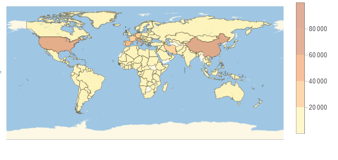
We start off by plotting a worldwide confirmed cases map using the built-in function of GeoRegionPlot
In []:
GeoRegionValuePlot[
 Normal@ResourceData["Epidemic Data for Novel Coronavirus COVID-19"][
   GroupBy["Country"], Total, #ConfirmedCases["LastValue"] &],
 PlotStyle -> Directive[Opacity[.4]]]
Will generate an output like so:
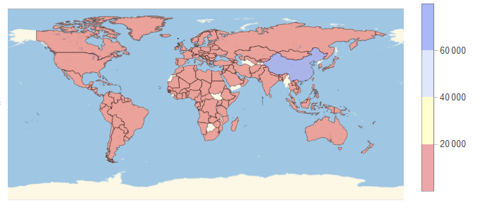
We can just as easily plot the recovered cases, note that I have included the option for ColorData to be ther reverse of a temperature map.
In[]:
GeoRegionValuePlot[
 Normal@ResourceData["Epidemic Data for Novel Coronavirus COVID-19"][
   GroupBy["Country"], Total, #RecoveredCases["LastValue"] &],
 PlotStyle -> Directive[Opacity[.4]],
 ColorFunction -> ColorData[{"TemperatureMap", "Reverse"}]

 ]
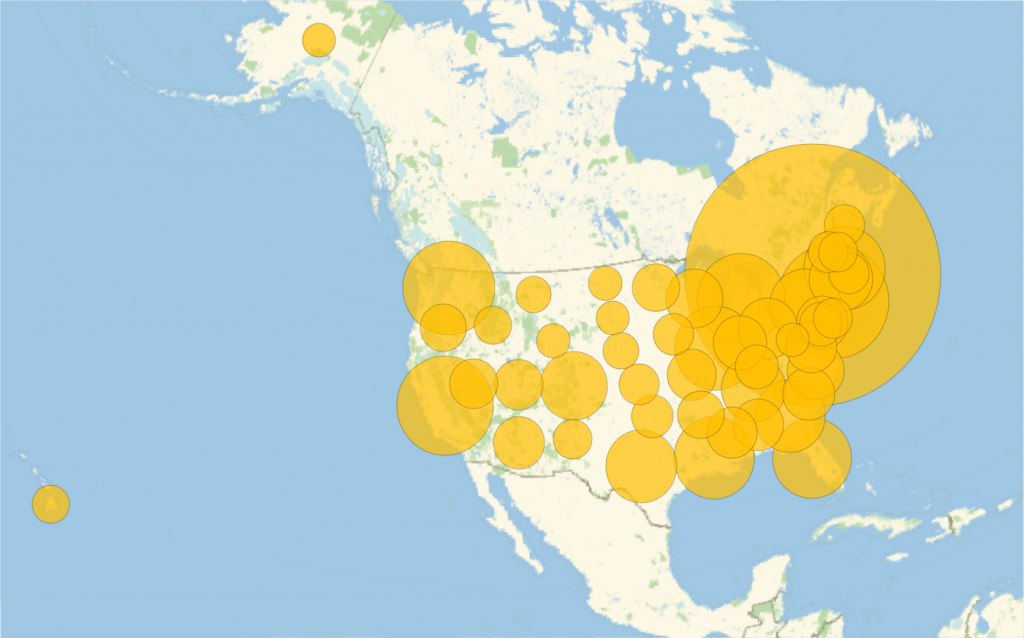
There are other functions that we can call upon in Wolfram to better visualise the data. Take the United States for Example:
In[]:Manipulate[
 GeoBubbleChart[
  Normal@data[Select[MatchQ[Entity["Country", "China"], #Country] &]][
    All, {#AdministrativeDivision, #ConfirmedCases[date]} &], ReleaseHold[
HoldForm[BubbleSizes -> ({0.01 + Part[#, 1]/500, Part[#, 2]/60000}& )[

Normal[
data[
Select[MatchQ[
Entity["Country", "China"],
Slot["Country"]]& ]][
       MinMax, Slot["ConfirmedCases"][date]& ]]]]]], {{date, dates[[1]], Dynamic[date]}, dates}, Sequence[
 ControlType -> Slider, SynchronousInitialization -> False, SynchronousUpdating -> False, TrackedSymbols :> {date}], Initialization :> {data = ResourceData["Epidemic Data for Novel Coronavirus COVID-19"]; dates = Sort@
     Union@Flatten@Normal@data[All, #ConfirmedCases["DateList"] &]}]
Will output a bubble chart with changeble dates
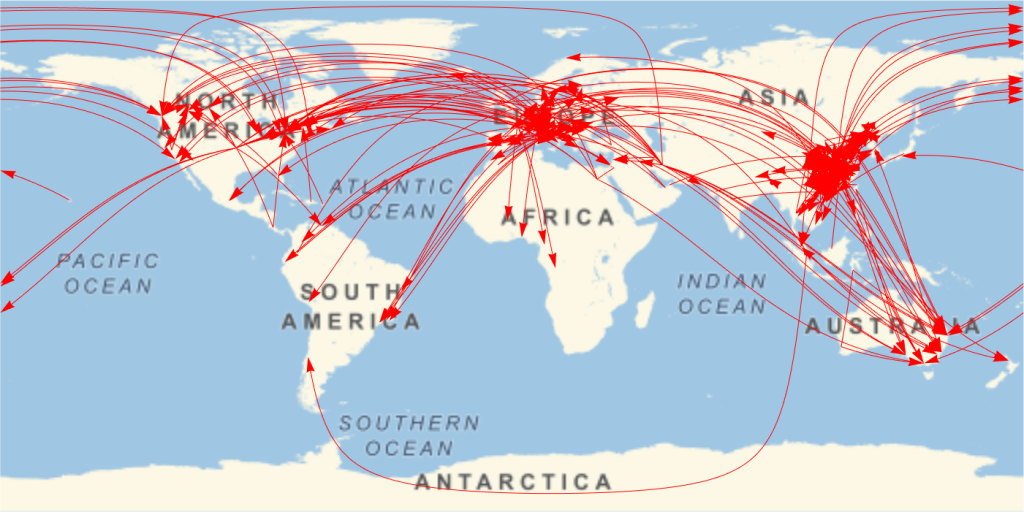
Patient Medical Data is also available from the data repo from Wolfram. You can plot some cool things with it, like the travel path of carriers.
In[]:
travelPath = GeoGraphics[{Red, Thickness[.001], Arrowheads[0.015], ResourceData[
     "Patient Medical Data for Novel Coronavirus COVID-19"][
    Select[(! MissingQ[#TravelHistoryLocation] && ! MissingQ[#City]) &], Arrow@GeoPath@Append[#TravelHistoryLocation, #City] &]}, GeoRange -> "World"]